Strategy, UX/UI, Interaction Design
Knobbe Martens
Print + Digital Campaign
Position a national legal firm as ahead-of-the-curve and activate the brand in print and digital channels, delivering effective advertising and award-winning web applications.
Campaign Tagline
CREATION + ACTIVATION
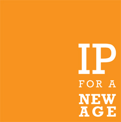
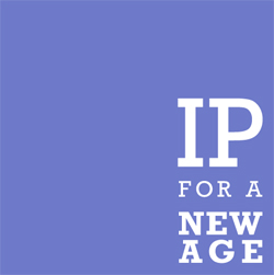
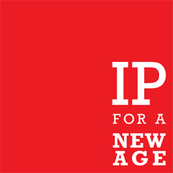
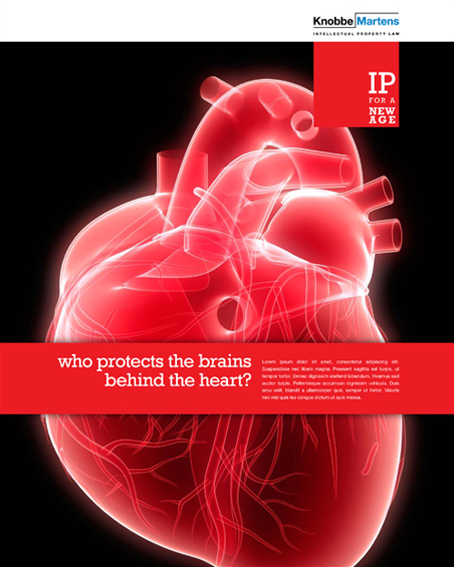
Knobbe Martens sought to reposition and brand its well-established legal services organization; they called JStokes who then called me. As the “visual” half of the creative team on the account it was my responsibility to put form and function to the many contenders written by my copywriting partner and, in the end, the final approved campaign tagline, “IP for a new age.” This visual device became the tag in and of itself and appeared in all branded communications, in all media and channels.
Print Campaign
B2B BRANDED CONTENT
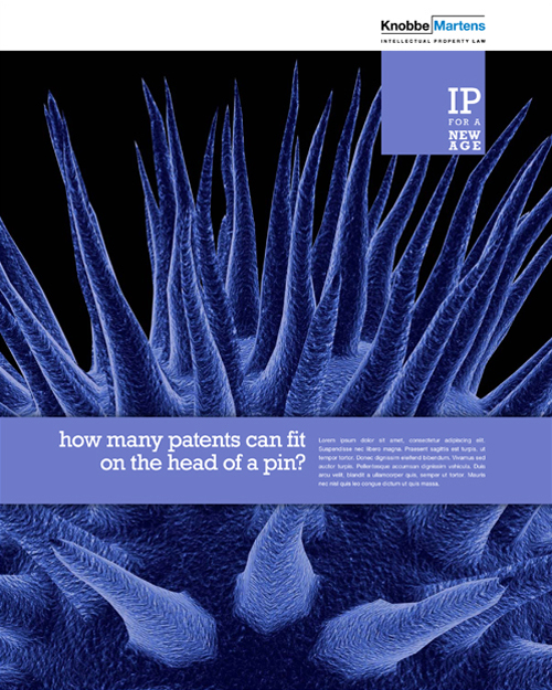
Much of legal brand and business communications rely heavily on old cliché visuals — well appointed libraries of leather-bound books, shiny brass scales and green-shade desk lamps, fountain pens casually laid upon perfectly fanned legal papers. “IP for a new age” required design and art direction with a difference. And when, through research, discovery and stakeholder interviews, we learned that staff attorneys and partners held numerous patents in their areas of representation it opened up and inspired new thinking on how we could represent the firm and brand in new and arresting ways.

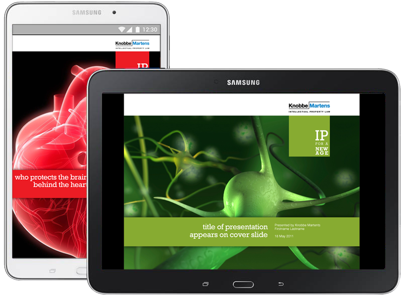
Digital Campaign
B2B BRANDED CONTENT
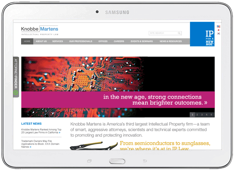
As the new look and feel of the brand was applied in print we began to do the same with the organization’s web properties. The corporate website was completely overhauled, from architecture and navigation to preparation and presentation of content. A system of color-based wayfinding and grid-based page templates, designed for unique content types and categories, were established and implemented across the site. The finished application was recognized and awarded top honors by both the Legal Marketing Association (LMA) and The Webby Awards.
Process
I’d worked with the team at JStokes for quite a while, so they were well aware of my ability to actively participate in a kick-off meeting, record all pertinent information shared, ask questions and seek answers that might move the project ahead effectively. The notes for this project were no exception. Because I knew going in the deliverables included both print and digital I found myself sketching with both in mind, knowing full well the limitations and opportunities of each media. I wanted to make sure that nothing was “lost in translation” as we applied and activated the new look and feel to all touch-points.
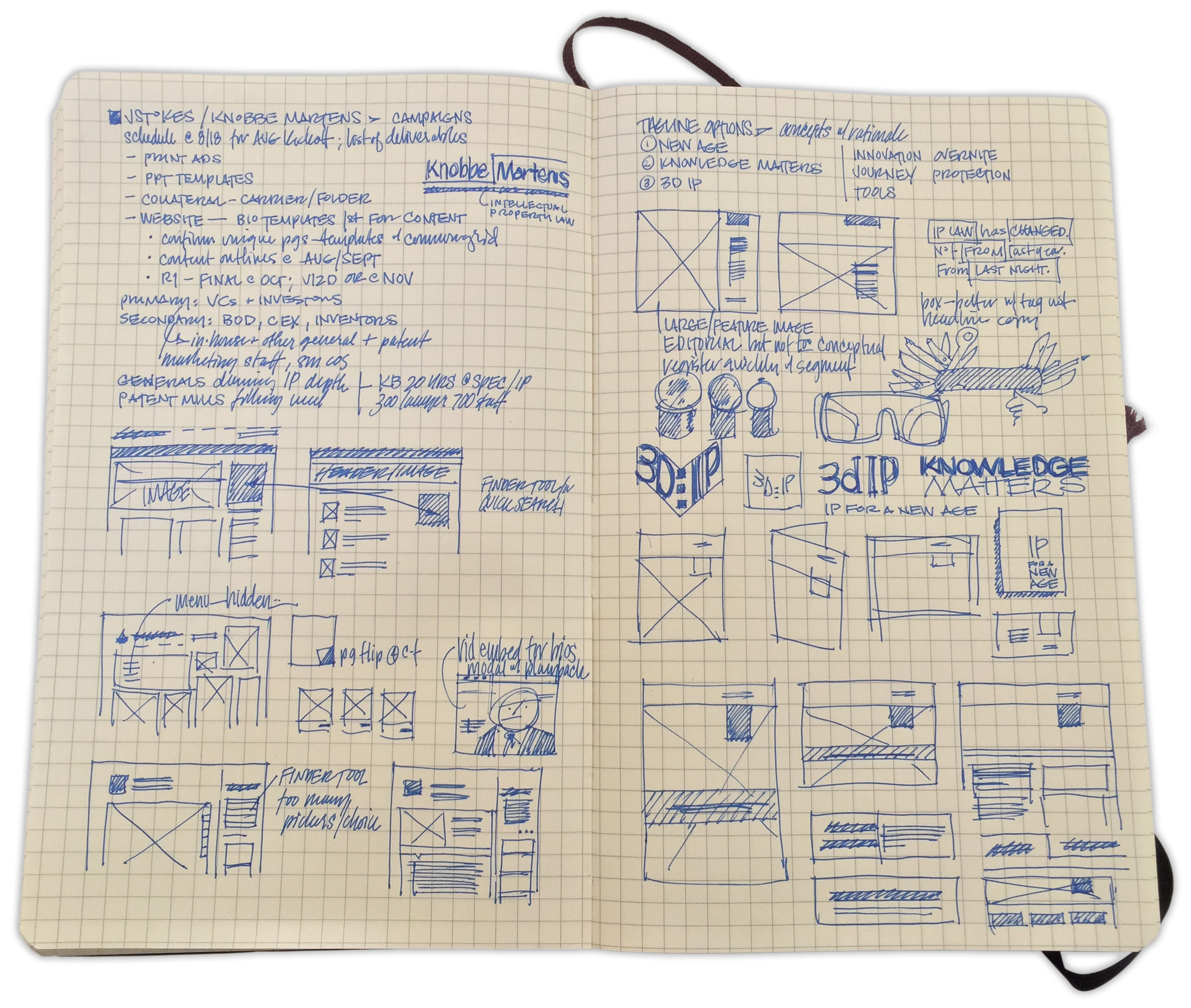
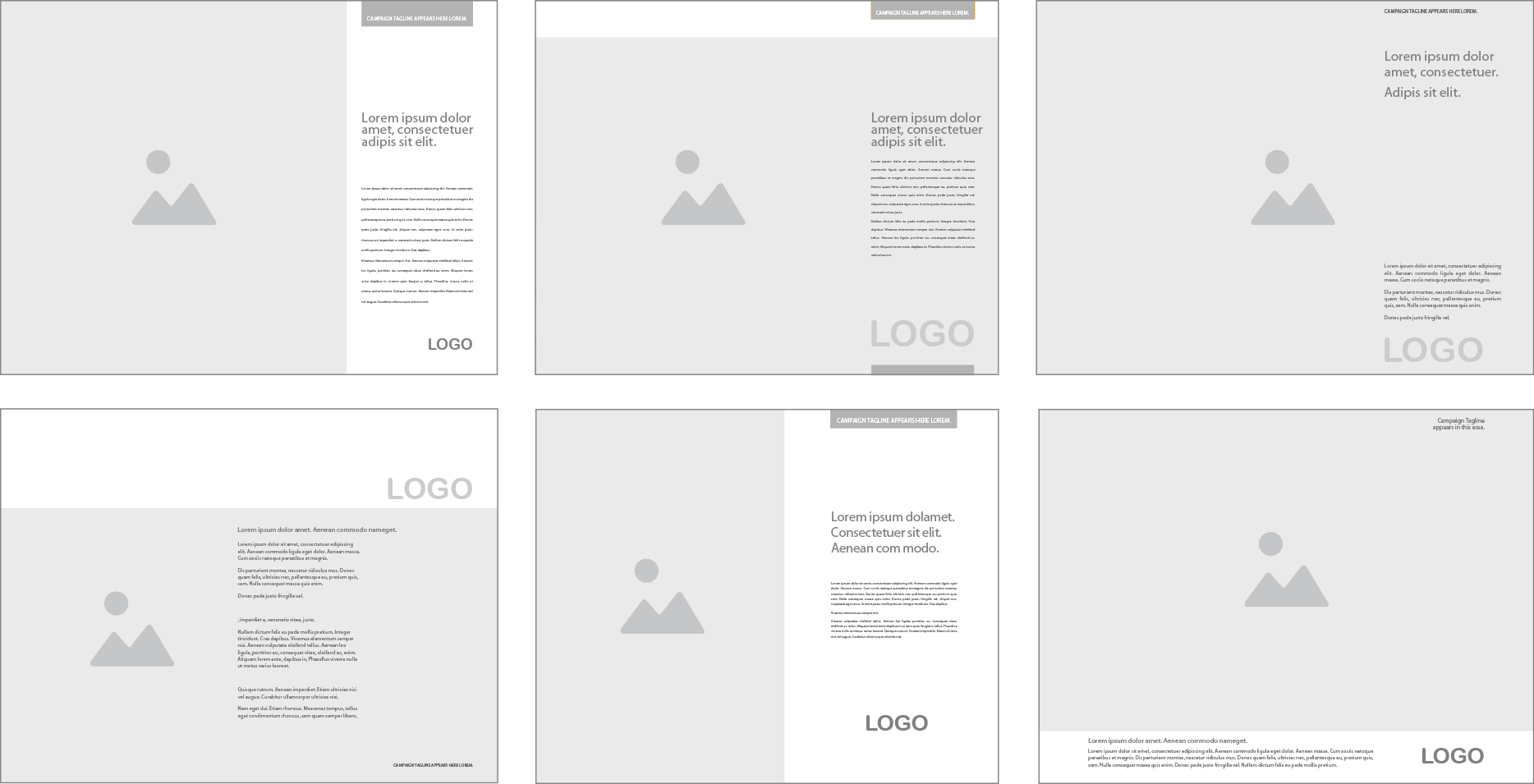
Having explored a number of phrase-plus-design combinations and presented the final candidates to the agency team, we quickly moved into executing on print and digital deliverables, applying the winning tag in all instances. Designing a grid template for trade publication ads consisted of moving the necessary graphic, photo and text components around to find the optimal design that met the strategic objectives of the marketing teams both in the firm and the agency.
The campaign was launched simultaneously in multiple channels: trade print, digital display, web applications, promotional and corporate collateral, in addition to presentation materials and new business tools.
Results
In addition to the recognition and accolades of both industry and technology leaders, the strategically strong and creatively unique campaign went on to impact both the client firm and the agency. Recruitment and hiring activities of the law firm were amplified and advantage was given to the newly repositioned law offices across the country. And the JStokes agency went on to produce more work for the firm as the net impact and results made evident what great creative can accomplish.